|
Carol, Directed by Todd Haynes in 2015, is about two women, one a divorcing mother, and the other a young sales clerk, who fall in love and brave a heartbreaking end to their relationship. While watching this film, I noticed more visual elements that I found striking or worth mentioning rather than focusing on the story. Don't get me wrong, the story that Carol tells is an engaging one that kept my interest, but there was so much else going on that had my attention. 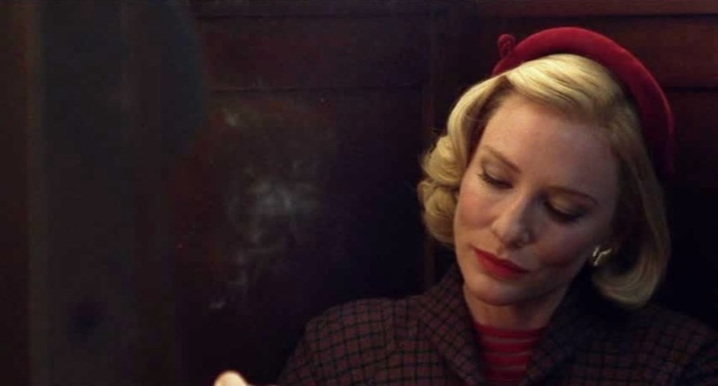 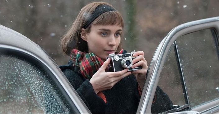 The distinction between the use of colors in the film and Therese's black and white photography was one of the first things I took note of. It was easy to catch onto Carol's constant wearing of something red, a scarf, hat, lipstick, nail polish, or more obviously, a dress or coat. This theme is seen throughout most of the movie, and almost disappears once Carol ends it between her and Therese. After their split, Carol wears more bland and emotionless colors like brown, beige, green, or black. This holds true with the feelings that both Carol and Therese are having, since they are no longer together, they both have this aura of lacking emotion and almost have a ghostly appearance. Although the colors shift from Carol's vibrant reds to drab browns, Therese's photography remains black and white, when she takes pictures before Carol, of carol, and after Carol leaves. I think this is a strong contrast between the separation that is Carol and Therese - Carol, a wealthy (former) wife and mother, who appears to have "it" figured out, and Therese, a young woman working a job she doesn't seem pleased with, finding her passions and interests, and still working her way through life. While reading Anna Leszkiewicz's article titled "Behind Carol: the photographers who influenced Todd Haynes' award-winning film" for Newstatesman.com, She writes about the photographers that motivated Haynes to film a certain way, have Therese photograph a certain way, and even decide the costumes and makeup for Carol. Leszkiewicz writes, "Aptly for a film that prioritizes female perspectives, many of these photographers were women: Ruth Orkin, Helen Levitt, Esther Bubley and Vivian Maier were all major influences for the team behind Carol." I thought it was really cool to read that Vivian Maier was a photographer that influenced these decisions in the film, because seeing the types of photos that Therese took made me think of Maier's photography, specifically the way Therese composed the photos and the way she placed people in the frame. Another element I noticed and appreciated was the realness of portraying New York in the 1950's, especially women's attire. When I saw women wearing cat eye glasses, petticoats, and ankle-length high waisted skirts, it was easy for me to understand what time period Carol took place in. The cars were also a dead giveaway of the 50's and the beautiful cars that were around in that time. I think the costume designers choices were spectacular, especially in differentiating the personalities of Carol and Therese. Carol was a bit of a more seductive and (Sexually) experienced and knowledgeable person; she wore red dresses with some cleavage, had her nails painted, make up done with red lipstick, etc. Carol was out there as far as her outfits. Therese on the other hand, was dressed more modestly - long sleeve shirts under her dresses, and her dresses, coats, hats, and everything else she wore had simple patterns and colors, which fit for her easy going and learning the ropes personality. Therese didn't stand out, she was a normal girl in her normal world, and Carol's contrast in outfits also worked as a visual representation of Therese's personality and tastes. A final contribution to the 1950's look is the overall color of this film - a foggy yellow haze cast over New York, our characters road trip, and the conclusion of the film. Below are some photos I've collected that I think are good examples of the costumes that Carol, Therese, and even Abbey, wore throughout the film.
0 Comments
Leave a Reply. |
